
I Built a Car Share vs Rental Car Cost Comparison Tool
Note: This article is based on Times Car Share and rental car pricing in Japan. Prices and services may differ in other regions.
Every time I plan a family trip, I face the same question: "Which is cheaper—car sharing or a rental car?"
I had a vague sense that "rentals are better for more than a day," so for 3-day trips I'd just book a rental without thinking. But had I ever actually compared them properly? No.
One day, I decided to dig in and do a thorough comparison.
This might be a bit long, but I'll share what I learned in the process of building this tool.
A Deep Dive Comparison
Starting from the Tokyo metropolitan area, I simulated various scenarios from day trips (12 hours, 350km) to 3-day getaways (60 hours, 650km). I compared three vehicle types: compact cars, compact minivans, and full-size minivans.
The results were surprising.
Results That Contradicted Common Assumptions
The conventional wisdom says "rentals are better for long distances." Car sharing has a distance fee (20 yen/km), so the further you drive, the cheaper rentals should be... right?
But when I calculated the break-even points:
| Vehicle Type | Break-even Point (12-hour day trip) |
|---|---|
| Compact Car | 136km |
| Compact Minivan | 244km |
| Minivan | 1,249km |
Calculated based on January 2026 pricing with gas at ¥165/L
Minivan break-even point: 1,249km.
When I saw this number, I did a double-take. Tokyo to Osaka is about 450km one way, so we're talking round-trip to Hiroshima—well past Osaka. Who drives to Hiroshima and back in 12 hours with any time left for sightseeing?
In other words, for typical leisure travel, minivans are often cheaper with car sharing.
I also ran the numbers for a 3-day trip (650km):
| Vehicle Type | Car Share | Rental | Difference |
|---|---|---|---|
| Compact Car | ¥26,400 | ¥29,530 | +¥3,130 |
| Compact Minivan | ¥30,800 | ¥41,110 | +¥10,310 |
| Minivan | ¥39,600 | ¥58,050 | +¥18,450 |
Calculated based on January 2026 pricing with gas at ¥165/L
For minivans—the go-to for families—the difference is ¥18,000. That's enough for a hotel upgrade or a nice dinner.
My "rent for more than a day" intuition needed serious revision.
If you'd like to use the savings from car sharing for experiences at your destination, consider finding accommodations on Rakuten Travel.
Why Does This Happen?
I looked into where this price gap comes from.
Rental cars follow a traditional business model. Staffed locations with in-person service. Pre- and post-rental cleaning and inspections done by employees. Vehicles sitting as inventory at stores. A people-intensive approach that's been around since the Showa era.
Car sharing, on the other hand, is an optimized model. Unmanned operations with just a parking spot. Users handle refueling and basic cleaning (incentivized by discounts). 15-minute increments mean one car can serve multiple users per day. Costs are stripped to the minimum, recovered through high utilization.
As a business model, rentals are "high price, low turnover" while car sharing is "low price, high turnover." The result is that minivans, in particular, show a stark difference in pricing.
The Decision to Build a Tool
After all this analysis, I realized something.
"This calculation is tedious to repeat, and others must have the same question. Why not build a tool anyone can use for easy comparison?"
So I did.
Defining Requirements
The essential inputs boiled down to just three:
- Vehicle type (different fuel efficiency)
- Duration (pricing is time-based)
- Distance (car share distance fees, rental gas costs)
Parking and meal costs apply to both, so they don't affect the comparison. Same with highway tolls.
However, the refuel/wash discount was important to include.
Car sharing offers a 60-minute discount when you refuel and wash the car. For long trips, you'll definitely refuel, so this discount effectively always applies. Without it, the comparison wouldn't be accurate.
That's why I added a "Refuel/Wash" checkbox.
Organizing the Pricing Data
Times Car Share uses a "maximum hourly rate" system. You're charged in 15-minute increments, with caps at 6 hours, 12 hours, 24 hours, and so on.
The key is determining which maximum rate tier applies based on usage time. This turned out to be crucial—getting this logic wrong would throw off all the calculations. It's actually where I spent the most time verifying.
Honestly, I got stuck here. I kept going back to the official pricing page until I finally understood: "Ah, so that's how the tier structure works."
UI Trial and Error
Design-Stage Decisions
I kept the input simple: direct distance entry. I considered having users select origin and destination for automatic distance calculation, but in reality, most people just want to input "about X kilometers." Rather than adding unnecessary friction, I decided simpler was better.
Instead, I added reference examples like "From Tokyo: Hakone round trip ~180km / Karuizawa round trip ~300km."
For results, I focused on clarity from the start. Rather than just showing two numbers side by side, I made "Car Share is ¥X cheaper!" the hero message, displayed in bold colors. Making it instantly scannable felt important.
Failure: Break-even Point Presentation
I added a feature to show the break-even point, but initially it just said "Break-even point: 123km."
Does that mean anything? "How does 123km relate to my current input?" I used it myself and realized this doesn't communicate.
So I changed it to contextual messages:
- "Drive 50km more and rental becomes cheaper"
- "At this distance, car sharing is always cheaper"
Now it's relative to the current scenario. That gave me a "now I get it" feeling, and I knew this was the right approach.
Success: Graph Visualization
Numbers alone tell you which is cheaper for specific conditions, but what about "What if I rent a bit longer?" or "What if I drive a bit further?" Those iterations are tedious with numbers alone.
So I added line graphs to visualize price changes. Two modes:
1. Fixed Time, Variable Distance Mode
Fix the rental duration and see how prices change with distance. "If I rent for 12 hours and drive 100km, 200km, 300km... how do the costs compare?"
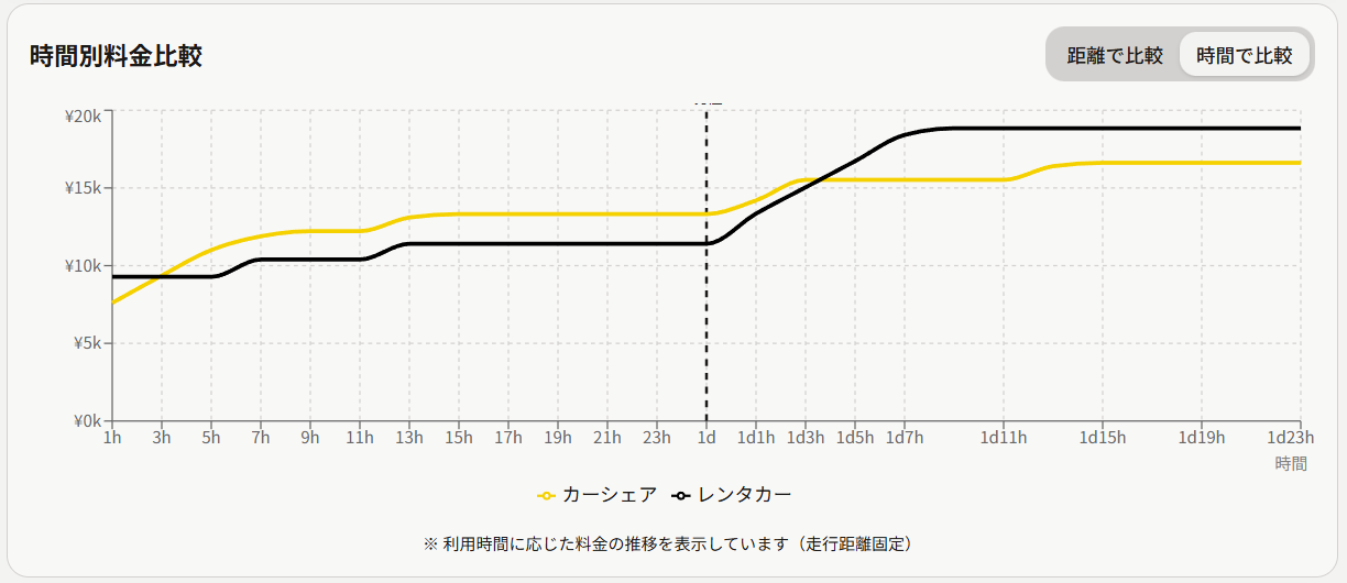
2. Fixed Distance, Variable Time Mode
Fix the distance and see how prices change with rental duration. I think this one is particularly innovative.
Rental prices jump in steps—6 hours, 12 hours, 24 hours. Car sharing increases linearly in 15-minute increments until hitting a cap. The graph makes this difference crystal clear.
For example, "I'm planning to drive 350km, but I'm not sure if it'll take 10 or 12 hours"—the graph shows "Ah, if I keep it under 12 hours, I'll stay within the cap rate."
With these graphs, the tool isn't just about "which is cheaper" but about planning your trip while checking prices.
The Finished Product
Here's what I ended up with:
https://car-sharing-vs-rental-car.tool.tielec.blog/
I built it using Lovable. It's a service that generates React applications from prompts once you've organized your requirements.
What surprised me was that this level of application could be built in just a few hours. Spend time on requirements definition, then let Lovable handle the rest. Pricing logic, UI, responsive design—all done. It came together so quickly I was honestly caught off guard.
If you're interested, you can try it here:
https://lovable.dev/invite/HN8QQET
How to Use
- Select vehicle type (Compact/Compact Minivan/Minivan)
- Enter duration (e.g., 12 hours)
- Enter distance (e.g., 350km)
- Check "Refuel/Wash" (for long trips)
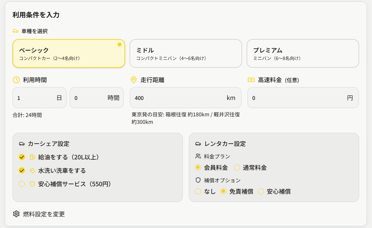
Results are calculated automatically:
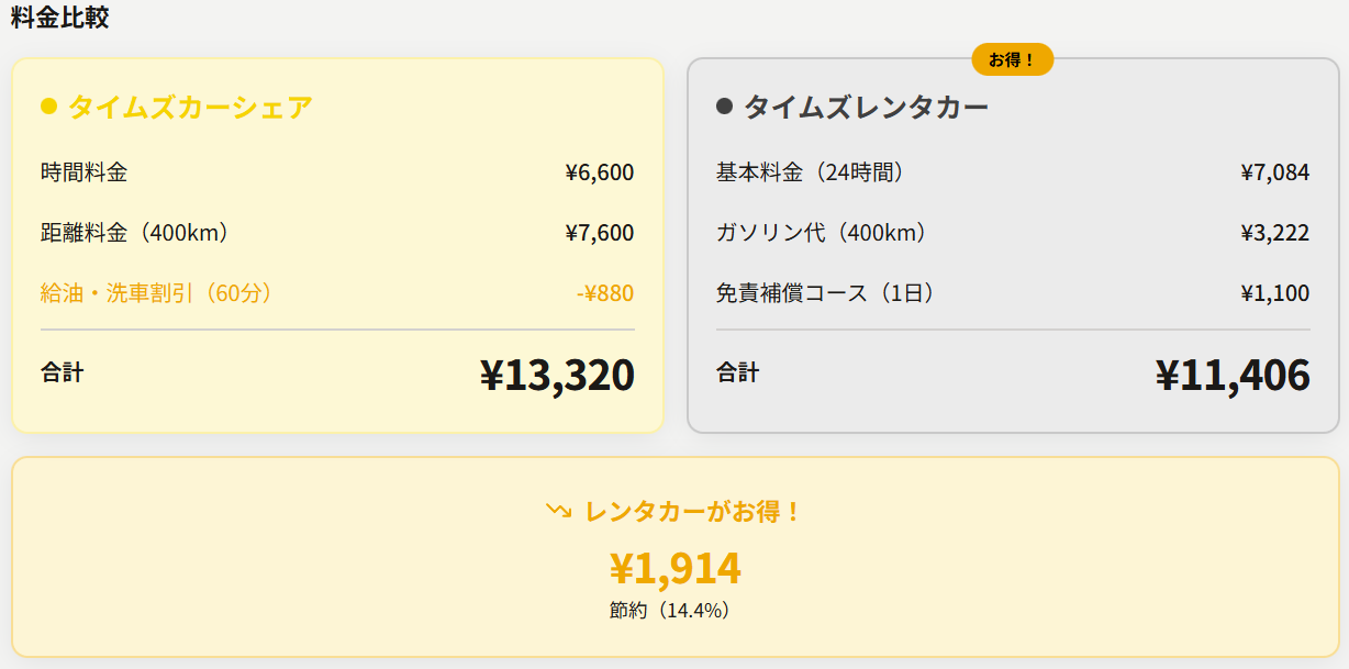
- Car share price (with breakdown)
- Rental price (with breakdown)
- Which is cheaper and by how much
- Break-even point information
- Graph visualization of price changes
Technical Choices
Why Lovable?
Building a tool like this normally requires:
- React project setup
- UI design
- Pricing logic implementation
- Responsive design
- Deployment configuration
...hours of coding work.
With Lovable, you focus on requirements and UI design, and it handles all the implementation. I could spend more time on "What inputs are needed?" and "What presentation is clearest?"
Spending time on understanding the problem rather than implementation was valuable.
Responsive Design
It's responsive with Tailwind CSS so it works on phones too. Trip planning often happens on mobile, after all.
Real-time Calculation
To save button clicks, results recalculate automatically when inputs change. Makes it easy to tweak conditions and ask "What about this scenario?"
Lessons Learned
Balancing "Usability" and "Information"
When building tools, there's always a temptation to add more features. But from the user's perspective, minimum input for maximum output is best.
Origin selection, detailed toll calculations, multi-plan comparisons... I considered many features but ultimately cut them. Keeping it minimal made the tool simpler and more usable.
Numbers Alone Don't Communicate
"Car Share: ¥16,000, Rental: ¥20,730" side by side isn't immediately clear.
"Car Share saves you ¥4,730 (23%)!" makes the decision obvious.
The importance of making conclusions explicit was reaffirmed.
Deep Understanding Informs Implementation
Doing thorough comparison and analysis first revealed what calculation logic was needed and what inputs were essential.
Rather than jumping straight to building, deeply understanding the problem first was crucial. Getting this order wrong would have produced a superficial tool.
The Gas Price Variable
When I first researched, gas was ¥165/L. By the time I built this tool, it had dropped to around ¥145/L. Break-even points shift (e.g., compact car: 136km → 123km), but the overall trend doesn't change significantly.
However, gas prices will continue to fluctuate. Users should be aware that this comparison has a "current gas price" assumption baked in.
Important Notes
A few caveats about this comparison tool:
- Pricing structures may change. This article and tool are based on January 2026 information.
- Gas prices fluctuate. The simulations in this article use ¥165/L, while the current tool uses ¥145/L. The conclusions don't change dramatically with gas price changes, but actual prices may differ.
- Non-price factors are not considered. Reservation availability, insurance coverage, and service differences are also important factors in choosing.
- This is just one perspective. Please verify current pricing when actually using these services.
Conclusion
This tool started from a personal annoyance: "I'm tired of asking the same question every time."
What I learned from building it is that everyday small questions are worth turning into tools. And with services like Lovable, the implementation barrier is surprisingly low. Understand the problem, organize the requirements, and the tool is done in no time.
If you've ever wondered "Which is cheaper?"—give it a try.
Related Reading
A book about marketing in the age of car sharing and subscriptions:

Was this article helpful?

If this article helped you organize your thoughts
a coffee-sized support would be much appreciated.
※ This is separate from tipping, but—
If you'd like to organize similar themes in your own context, I also offer dialogue sessions as a form of thought organization.
Recommended for you